
Cohort analysis enables businesses to channelize their efforts to obtain a deeper understanding of their customers
Segmentation helps businesses exploit their resources more effectively.It allows marketers to understand their customers better and tailor campaigns specific to consumer groups, ensuring they are most likely to purchase the products. Cohort analysis is similar to segmentation, but more focused on the historical data.
Cohorts are created, grouping consumers who share similar traits or experiences. It enables the businesses to ask more specific, tailored questions and the users to make more informed product decisions, resulting in lower churn and higher sales.
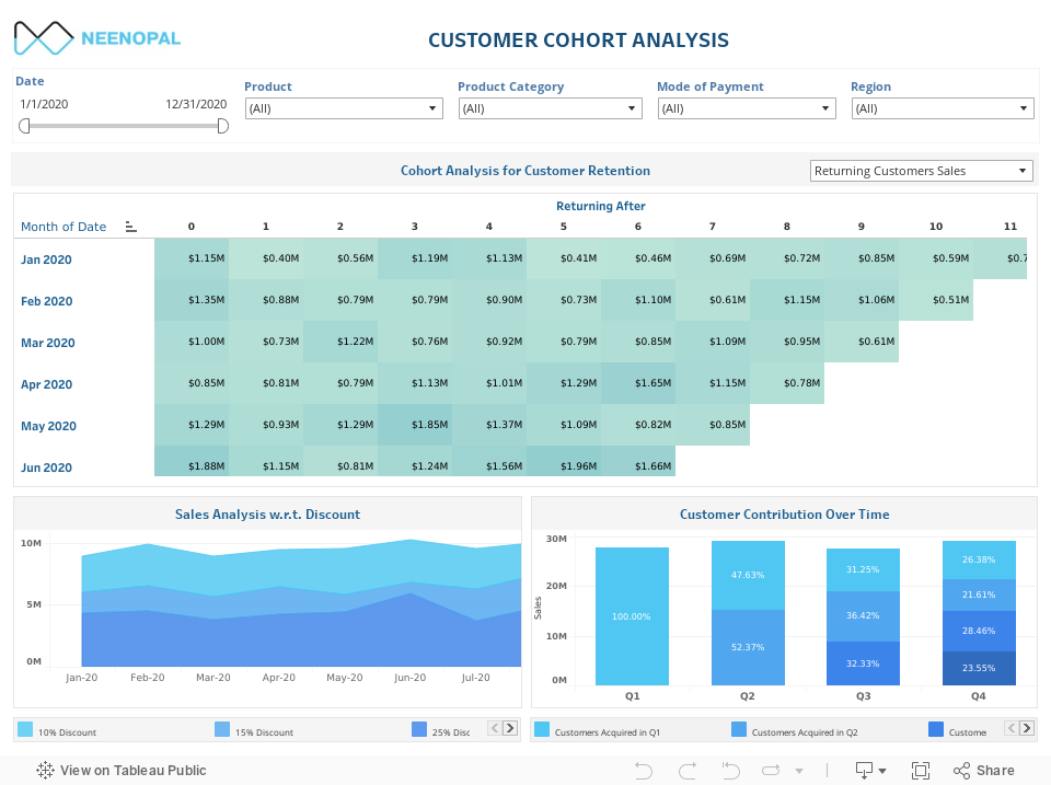
How to read the cohort analysis table? (Cohort Analysis for Customer Retention)
In this analysis, cohorts are created based on when the users first signed up.
- The first vertical column shows the months wherein the customers were acquired.
- The second column shows how many customers were acquired in the particular month.
- Horizontally, the x-axis indicates after how many months the customers are returning.
- The color shading makes it easier to see the cohort's value decaying with time.
To follow the behavior of each cohort across time, one needs to move horizontally. For example, for cohort 1 (customers acquired in January), 1.15M returned after one month and 0.40M returned after two months.
To compare the values among cohorts, one needs to move vertically. For example, considering customers returning after one month, from cohort 1 - 1.15M returned, whereas from cohort 2 - 1.35M returned.
How to read the cohort analysis (Sales Analysis w.r.t. Discount, Customer Contribution Over Time)?
- Cohorts are represented by different colors.
- The y-axis represents sales and the x-axis time in months/quarters.
- The graph basically represents how each cohort contributes to total sales over time.
- For the stacked area chart, the area under the chart represents revenue.
For example, in Sales analysis w.r.t discount chart, in Feb – 20, of the total 10M sales, the tooltip tells us the contribution of each cohort. One gets to know which discount cohort has contributed to maximum sales. Similarly, in Sep-20, the largest dip in sales is observed, and the 15% discount cohort has contributed the least.
Similarly, in customer contribution over time, cohort 1, representing customers who signed up in quarter 1, contributed to 100% of the sales in that quarter and 47.63% of the sales in the second quarter.
How does this dashboard help the business?
Cohort analysis helps businesses to study the impact of their activities on a specific group of customers (cohort). It helps in doing quick marketing experiments without heavy resource wastage.
In this dashboard, cohort analysis is used for tracking customer retention, the impact of loyalty discounts on cohorts and the effect of quarter-based promotions on cohorts. It helps the business in pursuing the below goals:
- Figure out the lifetime value of the customerAssess the current customer engagement activities and proactively plan for future
- Assess the effectiveness of current promotional activities
- Predict future user behavior
- Identifying the points where the business lose the customers
| Goals | Questions to ask | Dashboard views |
|---|---|---|
| Figure out the lifetime value of the customer Assess the current customer engagement activities and proactively plan for future Assess the effectiveness of current promotional activities Predict future user behavior |
How many customers continue to be active users in the next 12 months? Are new customers coming back more often than existing customers? |
Cohort analysis for retention |
| How is customer behavior with loyalty programs? How are the discount-based cohorts contributing to sales? | Sales analysis w.r.t Discounts | |
Identifying the points where the business lose the customers |
How do customers acquired at different quarters contribute to sales? | Customer contribution over time |
Cohort Analysis for Retention
How many customers continue to be active users in the next 12 months?
The dashboard gives the users two choices:
- To view the number of customers coming back after x months
- To view the monthly revenue generated by the customers coming back after x months
This analysis shows the customer churn trend and spots when the customers are leaving. With the answer for "when", one can easily go back to the time period and trace back to the activities or campaigns that did not attract customers.
Insights:
- The customer retention, as well as churn trend, is evident.
- It identifies the point in the customer journey where they tend to leave, thereby giving insights for reducing future churn.
While this analysis is good in identifying the point when the customer is leaving, it does not provide the reasons behind the churn. Behavior cohorts are needed for this.
Cohort Analysis for Discounts
How is customer behavior with loyalty discounts? How are the cohorts contributing to sales?
Suppose there are three different loyalty programs offering discounts – 5%, 10% and 15%. Cohorts are created based on this factor. The stacked area chart shows the contribution to sales for the different cohorts over time.
Insights:
- It helps the business identify which loyalty program has been successful over the months.
- It also helps predict the future pattern based on the present customer cohort trend.
Cohort Analysis – contribution to sales
How do customers acquired at different quarters contribute to sales?
Here, time-based cohorts, i.e., cohorts based on the quarter in which customers were acquired, are created and the cohort's contribution towards sales is tracked. For example, in the fourth quarter, if the sales contribution of the Quarter 2 - cohort is much less than the Quarter 1 - cohort, it may be because of a lack of satisfaction with the company's products by the Quarter 2 - cohort. It could imply a promotion campaign went wrong or better customer targeting by a competitor.
Insights:
- It helps in understanding customers acquired in which quarter contribute maximum to sales at a point.
- It could assess the impact of the quarterly activities on customers.
- It also helps in identifying the trend among customer cohorts.
- The dashboard includes two types of cohort analysis: Acquisition cohorts (Cohort Analysis for customer retention & Customer contribution Overtime) and Behavioral cohorts (Sales Analysis w.r.t discounts).
- The cohort analysis for customer retention gives a clear picture of when the business started losing its customers and at what rate. From this analysis, the business can draw insights on when is the best time for remarketing or what is the rate of acquisition needed to have sustainable growth.
- This analysis helps the business understand the long-term relationship with the customers in a cohort, and calculate the lifetime value of the customer.
- It helps identify the success of a marketing strategy, a new product launch, or a customer engagement activity based on the cohort's behavior over time. For example, here in Sales Analysis w.r.t.Discount, cohorts are created based on discounts and their behavior is observed to decide on the apt discount rate.
- The business can experiment with different strategies and decide on the best one to implement by analyzing how the cohorts respond to them
Conclusion
This dashboard showed three different types of cohort analysis dividing customers into cohorts based on acquisition month, loyalty discount program and acquisition quarter. Similarly, cohorts can be created, grouping customers based on any similar trait and analyzed further.